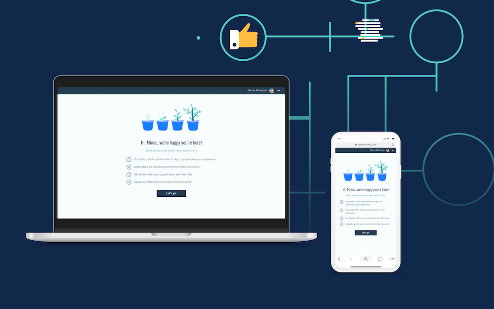
A case study about improving students’ onboarding experience on an online education platform.
Background:
From the end of 2020, I am working for an online education company, I will refer to the company as “E” in the following content for confidential reasons. I am working as the Product Design Lead and leading a team of 4 at “E”. I dedicate around 55% of my capacity to hands-on design work in one of the product teams whose focus is E’s students’ user experience on the study platform during their learning, and 45% of my capacity to team strategy and management as a team lead.
Here, I would like to showcase one of the quarter projects that our product team achieved.
Project goal:
To improve the students’ onboarding experience on the study platform, so they can realize the product’s value (reach the aha moment) quicker and start their course feeling confident and motivated.
People involved:
Product Owner, Designer, Engineers, Curriculum Editor, Copy Writer, Data Analytics
Hypothesis:
1.We assume that taking students through an onboarding tour of the platform on their first log in will:
- Help them get their head around how the platform works
- Make them feel welcomed and supported
- Retain them by:highlighting the value of the product and getting them to start investing in the product
2.We assume that encouraging students set up a study routine and goals at the onboarding stage will help them be better on track and achieve study success
3.We assume that offering customized learning experiences and support according to each student’s background will:
- Help them to learn more efficiently and effectively
- Keep being motivated through the study
At the end of the onboarding experience, students should:
- Have an understanding of the product’s value gained through first-hand use (not just us telling them it’s valuable)
- The “aha moment” is paramount to this. (the point during the onboarding phase when the customer realizes the value of your product in their context.)
- Be equipped with the information needed to use the platform successfully on their own (or know where to find this information quickly and easily).
- Feel confident and well-prepared to get started on the course
Main user story:
As a student, I am taken through a goal-based, action-driven onboarding of the key actions necessary to get me to my first “aha moment” on my first log-in.
Personas:
We define students who study with E into 4 main user personas. For confidential reasons, I can’t share details of the 4 personas in the case study, but I can list the needs of each persona here:
- Type1: wants a better life, to not feel behind
- Type2: wants to do something creative where they help people (where people help them to feel more fulfilled). Human connections.
- Type3: polishing their skillset
- Type4: getting their dream job
Onboarding survey:
In order to get more insights into our students’ needs, pain points, and expectations during the onboarding period, meanwhile to verify initially the hypothesis, we launched a survey.
We got 212 responses covering all the student types to the survey.
Here are some main highlights from the survey.
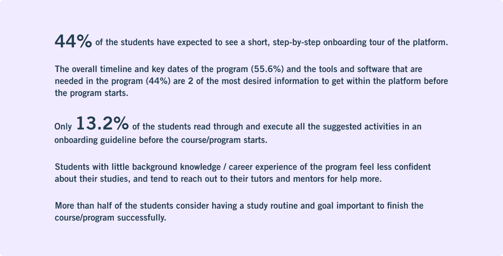
Below are some most common questions from our students during their onboarding period: (click on the image to see the full size)
Based on the survey, I invited 6 students to have user interviews to dive deeper into the points mentioned above. Here is the summary:
Main pain points:
- The onboarding guideline contains too much content, thus students tend to forget and find it hard to apply the guideline into practice.
- Students, especially those without former background knowledge (career experience) find it hard to do precise time management, as they spend much more time than expected on learning some tools and software that they need for the programs. Meanwhile, they complain that there are not enough resources on the learning platform about the tools and software in the preparation course.
- Students who have a full-time job find it hard to keep on track with the program timeline, as they have less time for studying and tend to maintain a fixed learning routine, especially when the difficulty of each course varies, it gets more challenging to do accurate time estimation.
Main needs:
- A concise and actionable format for presenting the onboarding guideline
- A platform that provides resources about tools and software preparation
- To form the habit of actively setting goals for learning, in order to keep on track, and form a study routine.
- To have a customized study journey according to the student’s goals and background.
Team ideation workshop:
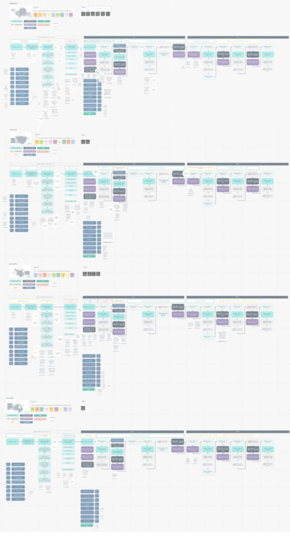
Based on the research data, I mapped out the user journey of the onboarding for the 4 user personas individually, which includes users’ key actions, emotions, and touchpoints.
I facilitated an ideation workshop, in which I asked all the team members (including PO, and engineers) to map out potential features and improvements across the user journey for each persona and write them down on the notes in a circle shape.
The image below shows the mapping of the workshop, I have to apply a blurry effect, as it includes very confidential content.
Then I ran a Crazy Eight brainstorming session with the team, so everyone had the opportunity to sketch their ideal solutions. Here are 3 How Might We questions that I defined to open our creative thinking.
HMWs:

At the end of the ideation workshop, we came up with some more concrete hypotheses:
- Breaking down the information of the onboarding guideline and presenting it in a format of onboarding tooltip would help students get a concise amount of information at the moment they need it, thus it’s easier for them to digest and they would get better prepared and ready to start the course.
- Enabling students to set up their learning goals at the start of the course (in the format of goal setting board/card), will help them form a study routine and stay on track.
- Knowing more about our students’ experience and background during the onboarding to understand their goals and motivation, thus customize the study experience and service accordingly, will increase the students’ motivation and confidence.
In order to achieve the points mentioned above, we will need a lot of support from the curriculum editors from the Education team to provide support on breaking down the content of the onboarding guideline, as well as provide content for the tools and software section.
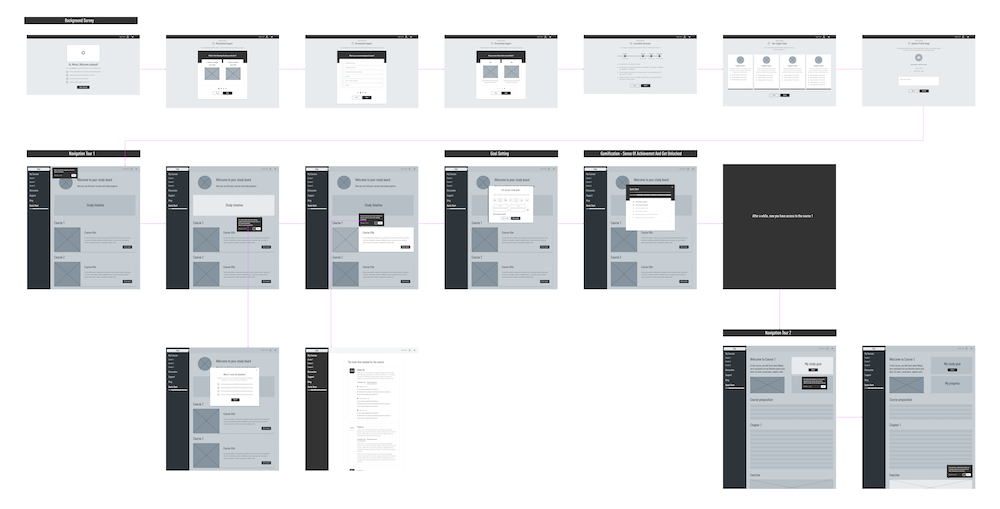
The wireframe:
Based on the result of the ideation workshop, I created the following wireframe (click to see full image):
User testing
The purpose of the testing:
The goal is to test the prototype with real users to validate the team’s ideation workshop hypothesis
User segment:
- Students from different courses who signed up shortly (July,August 2021) - Not including governmental-funded students
- User Personas - Octopus, deer, dog, shark (by perception during the interview)
Amount of users: 5-6
Design focus components:
- Utility: Does the onboarding flow satisfy the users’ needs?
- Learnability: How easy is it for the users to comprehend the tooltip format, especially the progress bar at the side navigation?
- Efficiency: How quickly is it for the users to get what they want to learn and achieve? Is it the right amount of information that provides?
- Effectiveness: Do the users tend to drop off in the middle of the flow (skip the walkthrough)?
- Satisfaction: How pleasant is it for the users to go through the flow?
Interview structure and questions:
- Interviewee name:
- Persona (assumption):
- Background:
- Time:
- Prototype Variant:
- Video recording link:
- Agenda:
- Short greeting and intro
- Ask the user to open the prototype link and go through the prototype while talking aloud about whatever he/she thinks. At the same time, the facilitator provides information if needed.
User Scenario:
Imagine you just signed up for a course at “E”, you used your login details to access the study platform for the first time. Before jumping directly into the course, you would like to get familiar with the functionalities of the platform and prepare your knowledge regarding online learning and some specific tools. What would you do?
Follow up questions after the walkthrough:
- How do you feel about the onboarding process so far?
- How helpful do you think the onboarding survey can help improve your learning experience?
- How comfortable do you feel about the amount of information that is provided?
- What do you think about the goal-setting feature?
- How helpful do you imagine the goal-setting feature would help you with setting up a study routine and keeping on track? rate 1-5, and why?
- How much do you think this onboarding process can help you understand the platform and get prepared with the knowledge you need to start the course? Rate 1-5
- If you can change anything reg the onboarding process you just experienced, what would you change?
- Was there anything that wasn’t clear to you?
Main results:
- Students are positive about the onboarding survey, they believe it can help to tailor their user experience to be more accustomed.
- In general, students think the walkthrough format to get onboarded is standard and helpful.
- The onboarding process track bar is considered to be confusing rather than helpful. Meanwhile, students are not attracted by the gamification part of the feature, as their goal is to get started with the course sooner.
- There are some coach marks that seem unnecessary, as the feature is intuitive enough even without a walkthrough.
- No one in the user testing clicked on the hyperlinks contained in a coach mark. The main reason was, that there is already enough information, and they didn’t want to be directed to more content or another new page.
- Only one student in the user testing click the play button on the welcome page’s welcome video, as the rest were urged to get the course started, and skipped the video.
- Students prefer to set a goal to submit a certain amount of exercise submissions per week rather than schedule and set goals by time slots, as it’s harder to predict.
Changes in the design:
Based on the results from the testing, our team decided to:
- Remove the onboarding process track bar, and remove the gamification part of the feature. (We agreed that gamification makes sense to be used in the learning journey itself than in onboarding).
- Remove some coach marks for the features that are self-understandable enough.
- Remove the hyperlinks and extra info on the coach marks, and makes sure students can re-start the walkthrough easily, so they can recall whenever they like - onboarding instruction should be a helpful tool, instead of adding more tasks to finish.
- Change the welcome video to a delightful and welcoming illustration.
- The study goal setup is based on the number of submitted exercises per week instead of time spent.
The design (responsive):
We did a second round of testing with the updated prototype, it came out good enough to move forward.
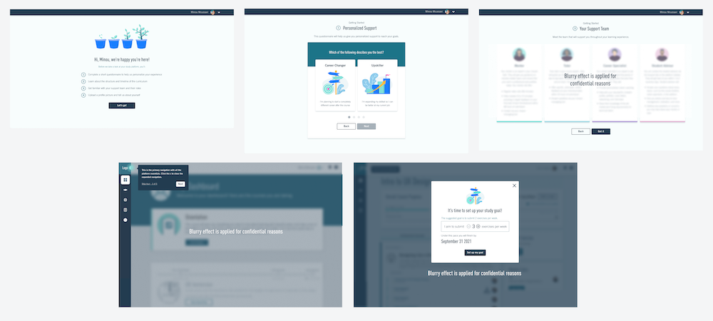
So I created the final design. To avoid revealing the confidential content of E’s study platform, I can’t show the full design, instead, I am only showing 3 screens of the onboarding survey, 1 screen of how the walkthrough coach mark looks like, and 1 screen of the study goal setup card to give an idea of the visual presentation of the feature (you can click on the images to see the full image).
Note: the illustrations in the design are created by me too.
Success criteria:
- 40% of users complete at least 60% of the walkthrough coach marks (3 out 5)
- 60% of users complete their profile (at least either photo or bio-one of the action that requires through the onboarding flow)
- 1-month retention increases by 2%
- Preparedness for 1st submission rating increases by 0.3
- Heath metrics: Retention before the course start stays stable
Risks:
- Students might feel tedious if executed poorly
- We fall into the trap of a product tour rather than a walkthrough (a product tour merely points out features whereas a walkthrough guides users through the actions they need to take to reach their “aha moment”)
- Make sure the feature works for governmental-funded students as well
What next?
Iteration plan after releasing:
Walkthrough coach marks
- If coach marks are successful, roll out the coach marks after the course starts on the dashboard and lesson page
- If coach marks are not successful, find why and propose another way to convey this information (e.g if the timing isn’t right, make users take the action of opening the coach marks…)
Onboarding survey
- If retention is good, no iteration is needed for now
- If retention is bad, understand what the problem is (e.g. users don’t want to give us information) and find solutions (e.g. make onboarding questionnaire optional, put questionnaire after course screens, make it visually more exciting, copy testing, fewer questions,…)
- Collaborate with the curriculum team and mentor team on customizing the study experience and service based on students’ goals and backgrounds.


